Pantone’s 2022 color, Very Peri, has been announced as the color for the coming year! Transition is the keyword for 2022, and, with that in mind, the Pantone Color Institute created a color that represents not just a transition, but also a fresh beginning. The Very Peri (PANTONE 17-3938) embraces blue tones with a violet-red undertone to communicate energy, to promote adventurous innovation and expression, as well as a cheerful attitude toward what surrounds us. I Lobo You has embraced this new color trend with a collection of innovative and opulent designs and artworks that embody Very Peri in a unique way.


As we move into a world of unprecedented change, the selection of the PANTONE 17-3938 Very Peri brings a novel perspective and vision of the trusted and beloved blue colour family, encompassing the qualities of the blues, yet at the same time with its violet red undertone
Leatrice Eiseman, Exectuive director of the pantone Color Institute

Displaying a carefree confidence and a daring curiosity that animates our creative spirit, inquisitive and intriguing PANTONE 17-3938 Very Peri helps us to embrace this altered landscape of possibilities, opening us up to a new vision as we rewrite our lives. Rekindling gratitude for some of the qualities that blue represents complemented by a new perspective that resonates today, PANTONE 17-3938 Very Peri places the future ahead in a new light.

SEE ALSO: Trend Alert! Discover The Best Interior Design Trends For Your Home

Contemporary designs embracing Pantone’s Very Peri color:


Modern Artworks Enhancing Very Peri:

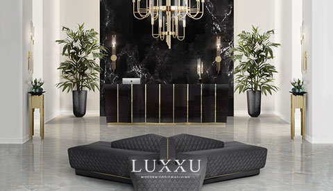
Inspiring Interior design projects:
I Lobo You gathered interior design projects in which designers added statement furniture, imposing sofas, bright tiles, and carpets in various purple hues to the interiors, demonstrating the amazing color’s versatility.
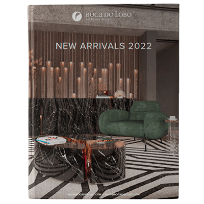
CLICK HERE TO DOWNLOAD BOCA DO LOBO’S NEW CATALOGUE!

PANTONE 17-3938 Very Peri is a symbol of the global reality and the transition we are going through. As we emerge from an intense period of isolation, our notions and standards are changing, and our physical and digital lives have merged in new ways. Digital design helps us to stretch the limits of reality, opening the door to a dynamic virtual world where we can explore and create new color possibilities. With trends in gaming, the expanding popularity of the digital world, and the rising artistic community in the digital space, PANTONE 17-3938 Very Peri illustrates the fusion of modern life and how color trends in the digital world are being manifested in the physical world and vice versa.
DID YOU LIKE PANTONE’S 2022 COLOR OF THE YEAR?
SEE ALSO: Design Miami 2021: Unmissable Highlights Of A Long-Awaited Event